Perfecting Your Digital Call-To-Action (With Examples!)

Your content and online presence isn’t worth much without a strong digital call-to-action.
Let’s face it, a digital call-to-action is necessary if you want your audience to take the next step. Imagine a potential customer reaches your homepage while browsing solutions to their problems and has nothing to click on urging them further down the sales funnel…

Your call-to-action has a direct impact on your conversion rates. No matter what point in the sales funnel your audience might be at, there’s always a way to urge your viewers further along.
In this post we’ll dive into the digital call-to-action, how to perfect it and show some real-life examples of killer digital CTA’s.
Quick Takeaways:
- A strong digital call-to-action can directly affect your lead generation efforts and conversion rates.
- Follow key best practices when developing your digital CTA, like emotional language, formatting and creativity.
- Always be sure to test different versions of your CTA, because Rome wasn’t built in a day!
Breaking Down the Call-To-Action (CTA)
You likely see a digital call-to-action every hour throughout your day. From your daily work to your social media life, CTAs are everywhere.
The basic premise of a call-to-action is encouraging users to take the next step and “Download now,” “Gain Access,” “Sign-up,” “Contact Us,” etc. It directly connects sales to marketing.
A good CTA has three things to accomplish:
- Provide clarity on your content
- Give your user or reader direction on what to do next (i.e. push them down that sales funnel!)
- Show results
If you want people to take the next step — and who doesn’t — you’ll need to optimize your digital call-to-action. Fear not, we have some insider tips to help.
Perfecting Your Digital CTA
First, go past what’s overdone and quit being boring. The market (and online world in general) is completely oversaturated, so if you want your content, product or service to stand out, you need to go the extra mile. Here are some steps to take to inspire your CTA’s.
1. Use strong language and evoke emotion
No, I don’t mean expletives – unless that’s the space you’re in!
Jokes aside, the language you include in your CTA makes a big difference. Replace vanilla phrases like ‘contact us’ with ‘contact us today for X limited time offer!’
FOMO is a real thing, and people in the professional world are not immune. Offer them something they can’t resist. The more urgent the better.
Amazon and other ecommerce and B2C companies do this really well (a little too well if you ask my bank account) when you have an item in your cart. They tell you just how many items they have in stock and, conveniently, how many more people have said-item in their cart.
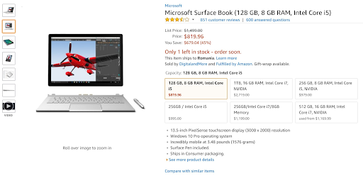
Image Source: Medium.com
2. Make your CTA stand out
Your CTA won’t accomplish anything if your potential customer doesn’t even notice it.
Make your CTA stand out by utilizing contrasting colors and white space on your website. We use a two column blog page with CTA’s on the right hand side here at MIG. Make your CTA a button so it’s loud and clear.
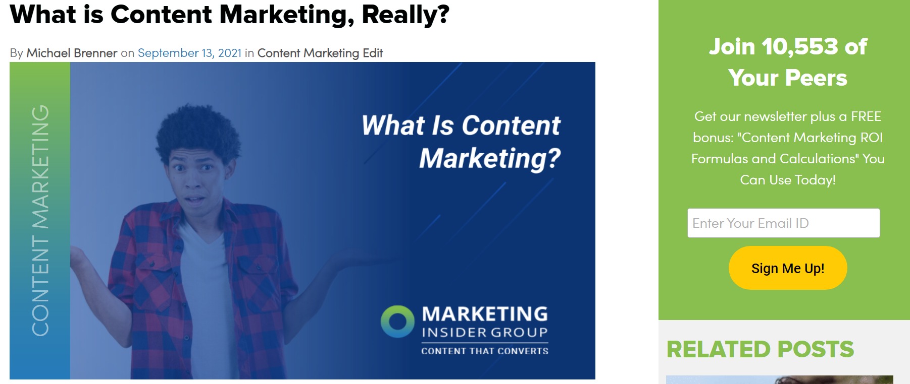
If you’re looking to include a call-to-action in your blog posts – and you should be – make sure it stands out from the rest of your text. You could choose a different font color, bold the text, italicize it or go crazy and do all three. (Spoiler alert: check out our final words for an example.)
3. Keep it brief
You’re trying to catch your viewers attention, and human attention spans have depleted to that of a goldfish, so don’t try to do too much. Short CTA’s are more likely to spark interest.
Short CTA’s also leave more for your viewer to wonder about. What is the limited time offer in the button? This is when the FOMO comes into play again and they just can’t help but click!
4. Personalize your CTA
Personalize your CTA’s where you can to maximize results. The most obvious example of this is within your emails.
When you have the data to use someone’s first name, job title, or industry, you should. You don’t have to include it every single time, and you shouldn’t. That would be kind of like going on a date where the person read online that using your first name in every sentence will make you like them more. It’s weird and annoying.
Personalized CTA’s are well worth it though. Research from HubSpot has shown that a personalized CTA’s perform 202% better than a basic one. This personalization can come in many forms. Use the data you have, from user location, to job title, to their place in the sales funnel.
5. Test, test, test!
You won’t perfect your CTA on your first try. One option is to go the traditional route and use A/B testing to analyze results from different CTA’s. Play around with different phrasing, offers and formats.
Artificial intelligence is also making its way onto the testing scene. Automation can take the uncertainty out of the old school A/B tactic. Plsu, you can test many more combinations of variables compared to traditional A/B.
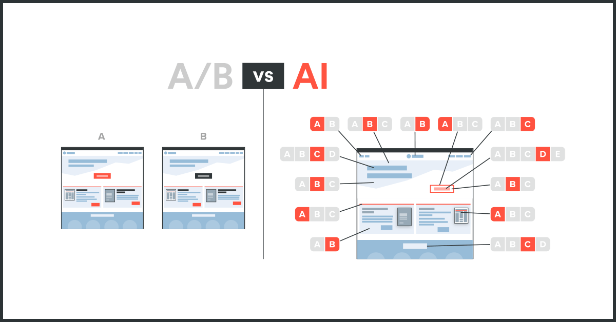
Image Source: Evolv AI
No matter what tactic you take, a CTA is nothing without testing. You’ll never know the true potential of your call-to-action without trying a few different formats.
Best Call-To-Action Examples
To start, let’s look at landing pages with crazy-good CTAs.
Spotify
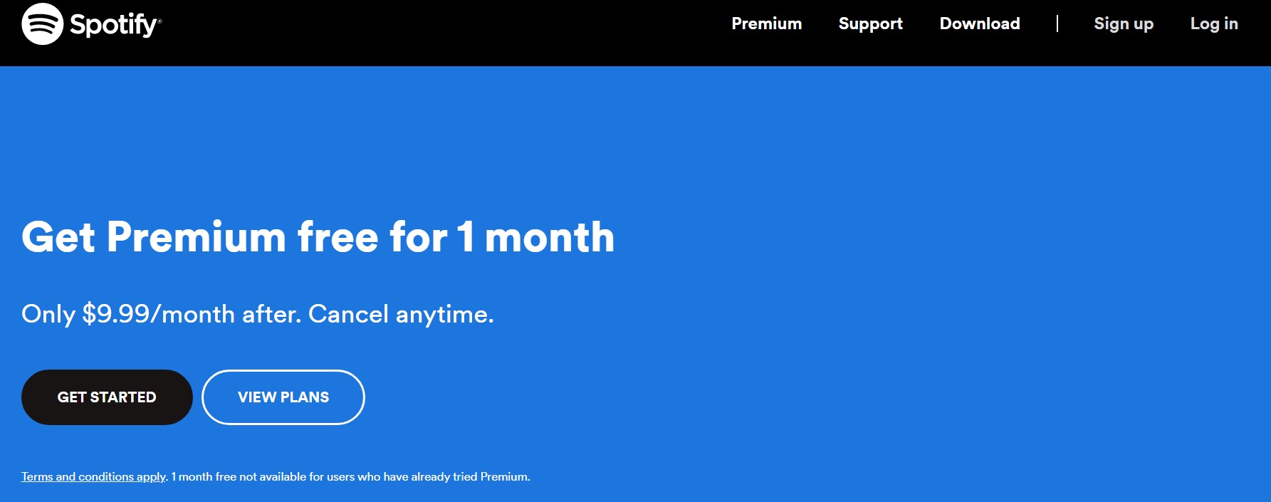
Spotify literally uses five sentences (and short ones!) to describe what you’re signing up for.
Not only do they offer their premium service for free (first thing and boldly!) but they provide an easy button to get started, as well as more information about their plans and exactly what you’d be signing up for.
The enticing offer of one free month evokes emotion, because who wants to miss out on something that’s free?! The “get started” button design is bolder and darker than the ‘view plans’ option, which is no coincidence either. The contrasting colors draw your attention.
Netflix
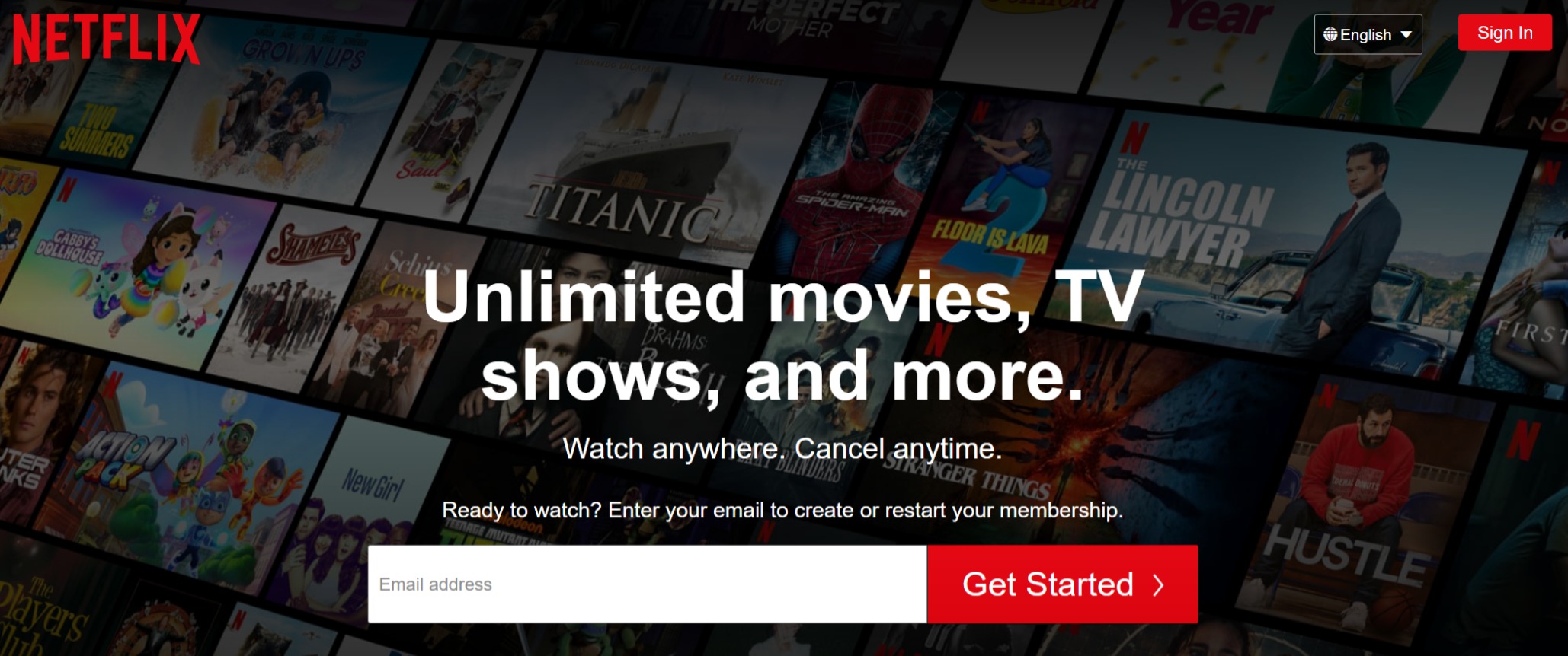
Netflix takes a similar approach. The copy is short, sweet, and addresses any potential issues. Watch anywhere. Cancel anytime.
The largest text on their site leaves more to the viewer’s imagination as well. What’s the ‘more’ in “and more”? Well, you won’t know until you sign up! They also use a standout red button with an arrow to depict action.
Dropbox
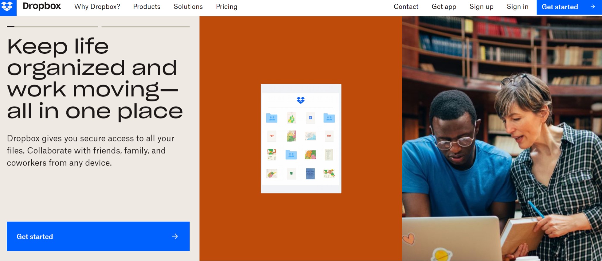
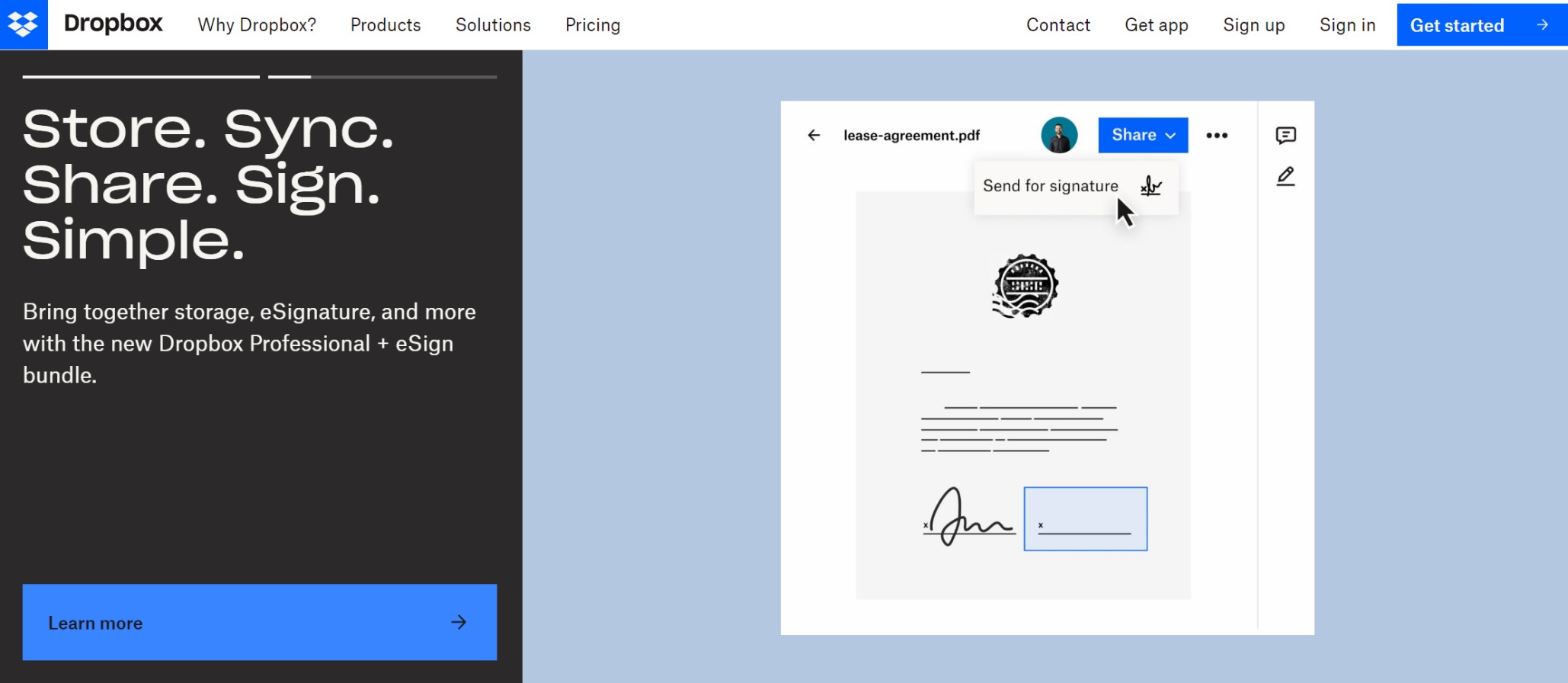
Dropbox thinks a bit out of the box with their homepage CTA. And they give two options for their call-to-action.
Their homepage features a carousel CTA. The first of the two urges you to “get started” and entices you with solving your organizational and productivity problems. The next CTA in the carousel gives a bit more detail to what they do, in an aesthetically pleasing tautogram. The button at the bottom offers to give more explanation on their software, inching a potential viewer further down the sales funnel.
QuickBooks
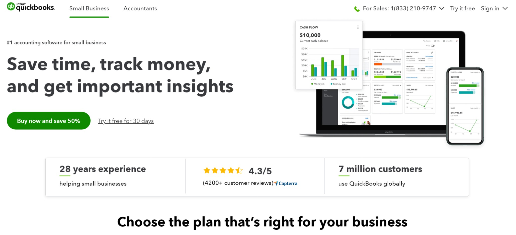
QuickBooks is another case for a double call-to-action. Clearly, they’re using their sale of 50% for a “limited time” to spark a sense of urgency. (Spoiler alert: this offer has been in place for years!)
As a viewer, you also have the chance to try the software for free for 30 days, and we all love free stuff!
Underneath their CTA, the Quickbooks team offers more information on their platform and what they do, so even if a visitor scrolls, they’re being exposed to more information.
Slack

Slack is another company that hits you with a double-whammy. There’s the option to try their platform for free, but then there’s the brighter, higher contrast button that urges you to go straight for the sign up! Even better, their sign up button has the Google icon, something everyone will recognize.
VRBO

Are you looking for a new vacation home or are you looking for an escape? VRBO evokes emotion in their CTA, describing your next trip as an escape to discover.
For some people that might mean a beach vacation and for others it means a trip to the mountains. VRBO has it all, and that’s kind of the point.
DivvyHQ
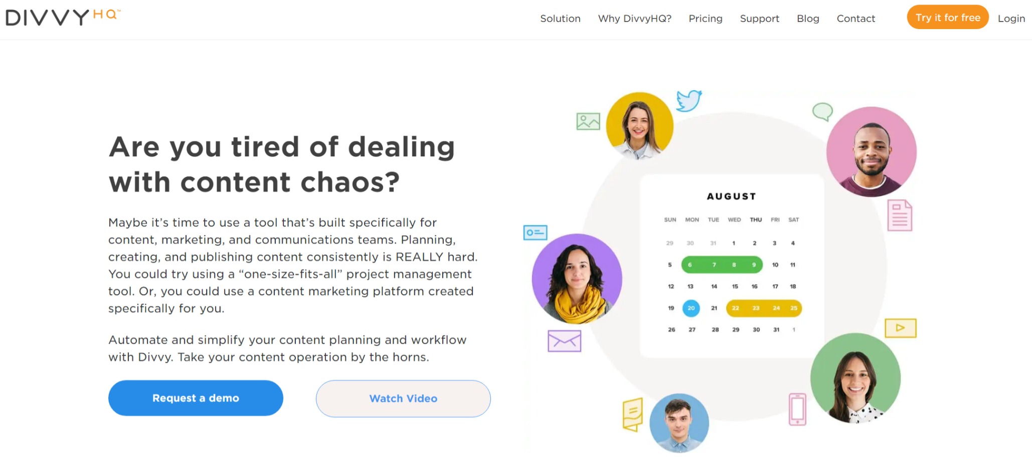
DivvyHQ is in a competitive space. Their content planning tool has a unique value: its personalization. That can be hard to put into words. To fix that? Divvy features a ‘request a demo’ CTA on their homepage. If you don’t have time for a demo, there’s a video you can watch instead.
This is a great CTA for visitors at the top of the sales funnel. Maybe they’re browsing different platforms, toying with the idea of committing to one. A demo offers a personalized experience with the company. If they aren’t quite that far in their journey, the video example will suffice.
Divvy also has a banner at the top of their page that’s ever-present while you scroll, featuring a ‘try it for free’ call to action in a bright, contrasting, orange button. So, they really hit all the marks.
Waterboy
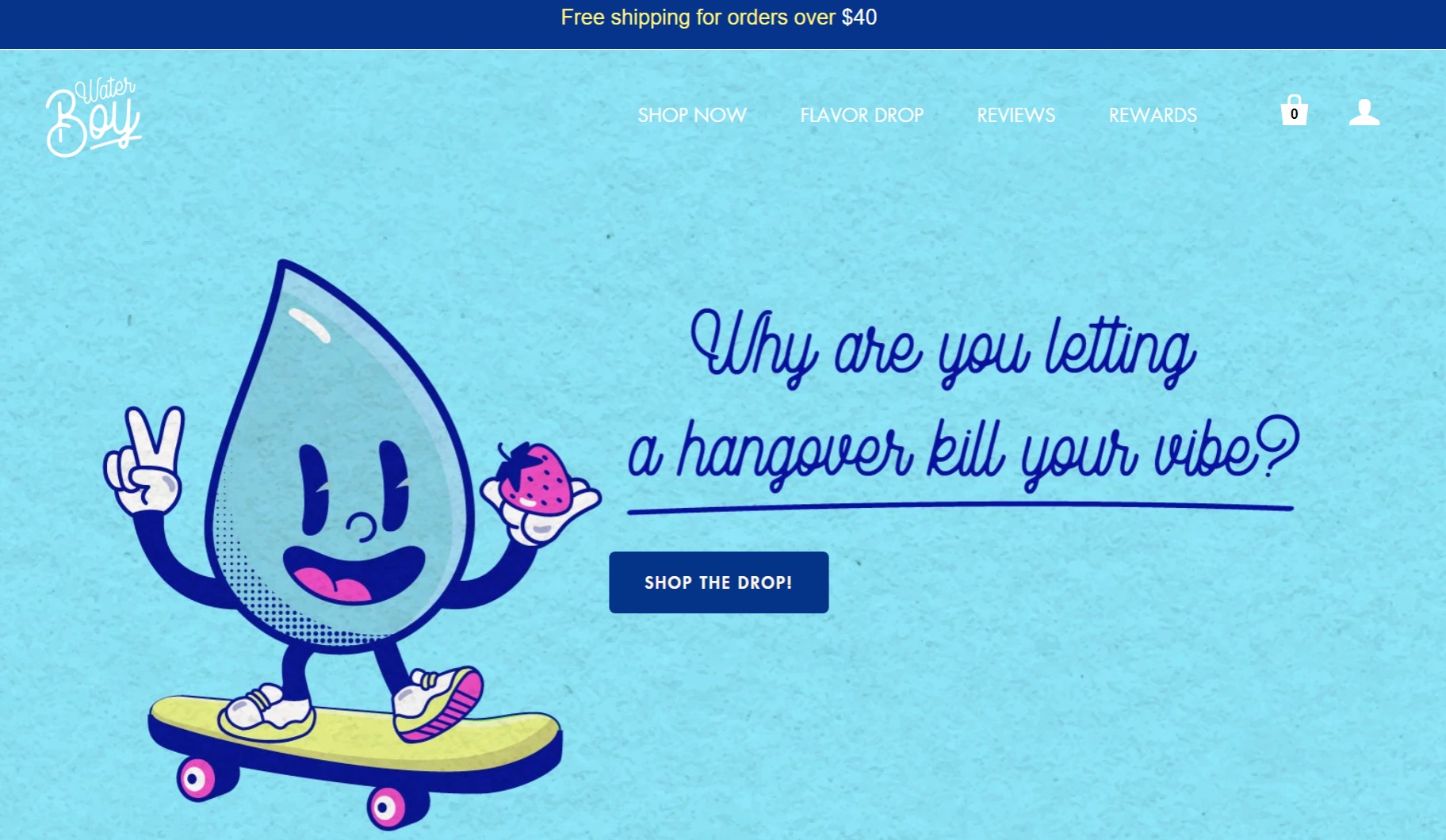
Run by a group of 20-somethings in Austin, TX, Waterboy is one of the latest and greatest inventions in hangover cures. And in an industry that hitches itself on over-drinking, you can have a little fun.
Waterboy gets creative with their CTA, speaking directly to its largest market, other 20-somethings. Gen Z is all about the vibe, so their emotional pull is on point. Their action button says “shop the drop!”, a fun way to say ‘check out our latest inventory.’
The banner at the top of their page also offers a deal: free shipping on orders over $40. There’s that golden ticket word again!
Televerde
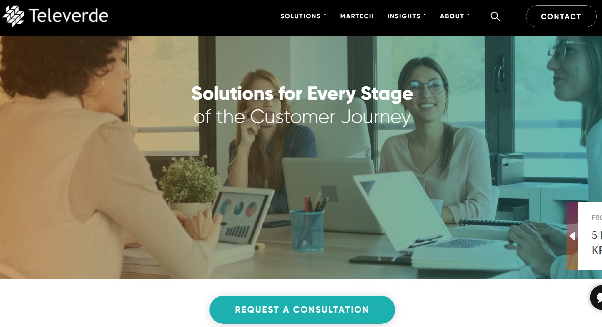
Televerde gets tech savvy with their homepage CTA, placed underneath a live motion back laid image. Again, we see the banner at the top with a contact button, but more important is their ‘request a consultation’ high contrast, bright blue button.
This is another example of a company that offers highly personalized solutions. Televerde uses data, technology and people to provide improved demand generation across marketing, sales and customer experience. Because of all these moving pieces, a consultation is the most effective way to snag a lead who’s browsing the market.
Intermedia
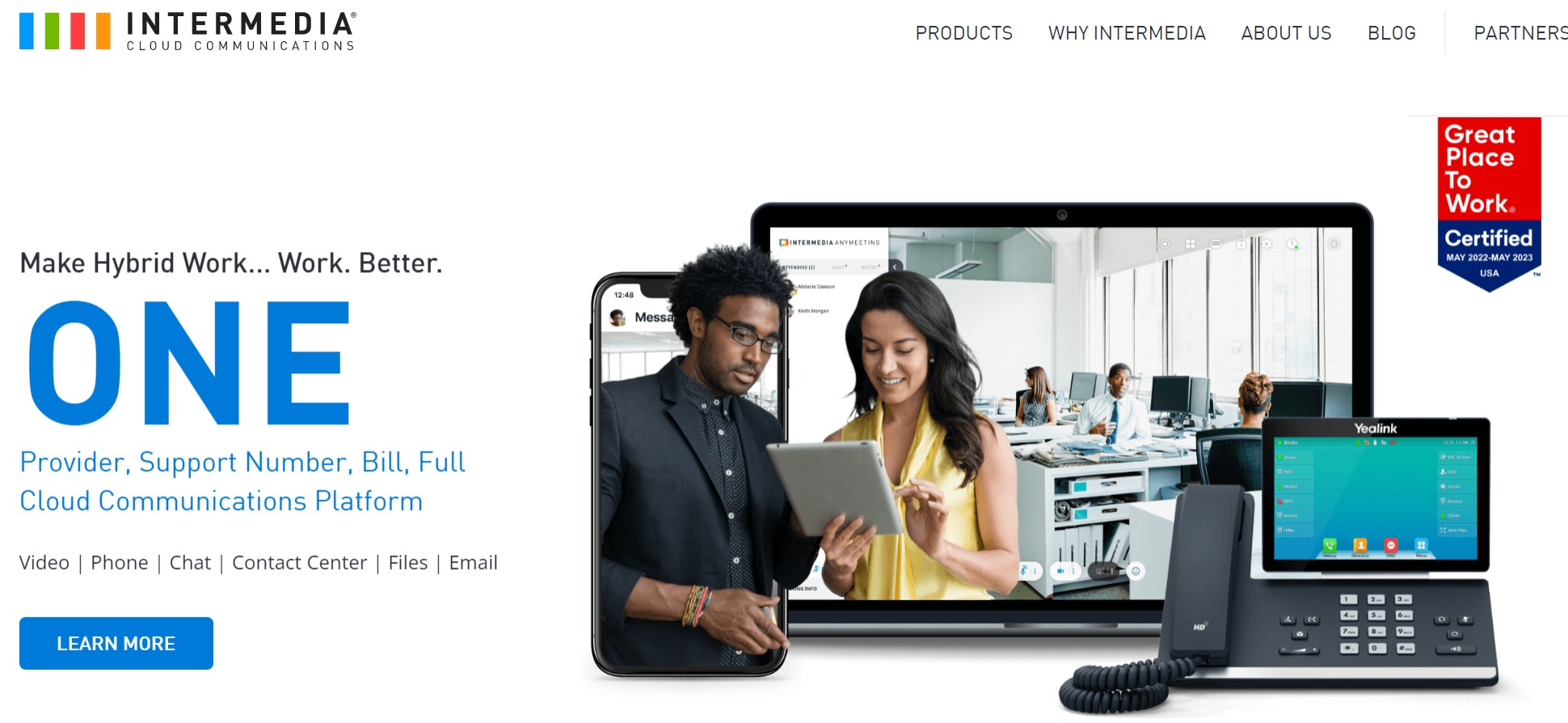
Intermedia specializes in cloud communications. Their claim to fame is their organization of many different types of communication on one platform to boost productivity. And they get that point across on their homepage with the large, high contrast, bright text.
Their CTA button stands out as well, urging viewers to learn more. This again is targeting those top of the funnel browsers who are considering a solution to a problem they’ve been facing.
Glossier
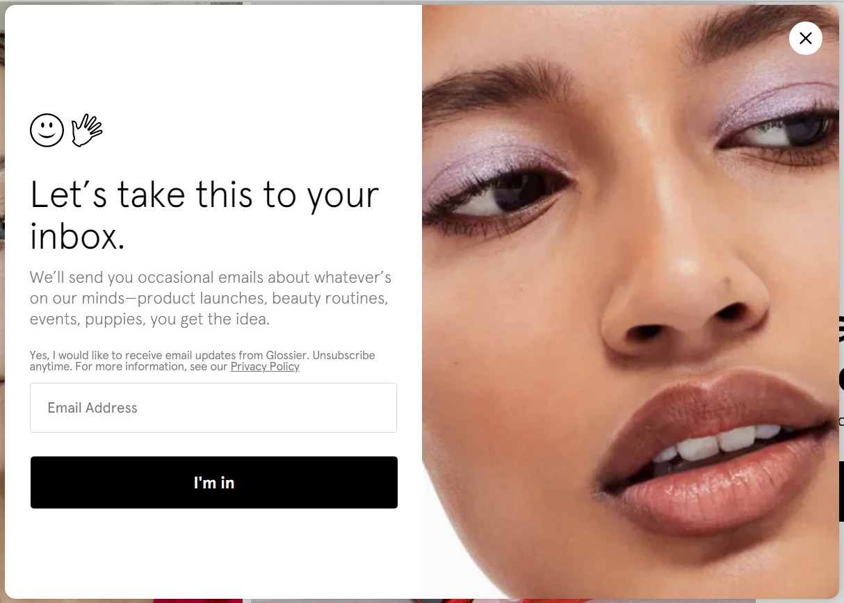
This relatively fresh-to-the-scene makeup brand, Glossier, also has some fun with their CTA. Their pop-up is the first thing you see when you go to their page and features an intriguing image (especially for make-up lovers, I mean look at that eyeshadow!) as well as symbols to keep the text interesting.
The play on words ‘let’s take this to your inbox’ is a fun way of getting a visitor’s email address. Plus the company entices you with an insider scoop when you sign up.
ActualTech Media
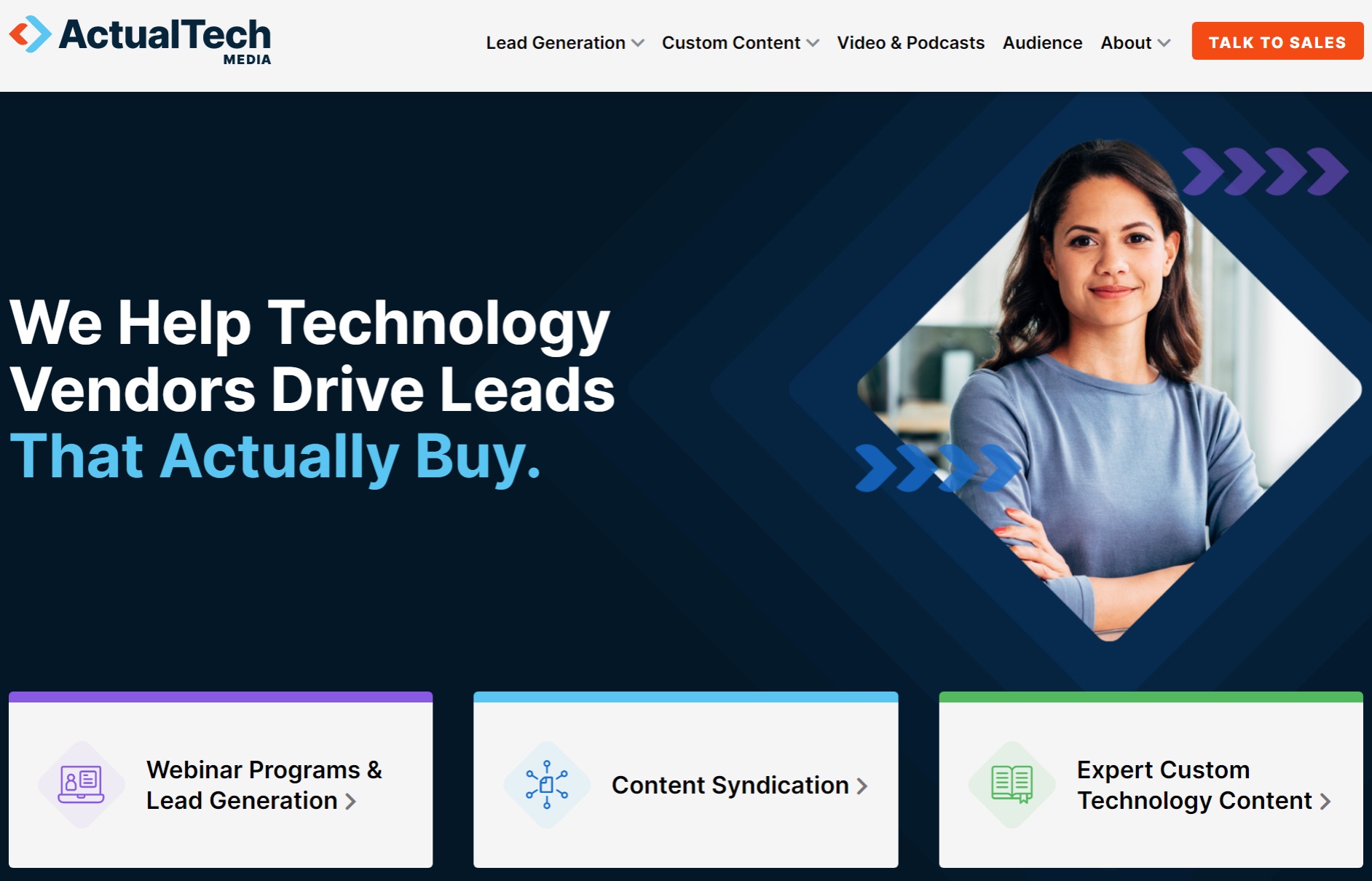
ActualTech Media is taking the content syndication world by storm, redefining what it means to syndicate content for lead generation in the technology sector.
Their unique take on lead generation leaves a lot to be learned by potential customers. Their homepage CTA is aimed towards top of the funnel prospects who are going to want to get educated.
ActualTech places an emphasis on their homepage that they drive leads ‘that actually buy.’ Below are their top three areas of expertise in bright, contrasting buttons. Click on each to be taken to well-designed landing pages chock-full of easily digestible information.
Optimizely
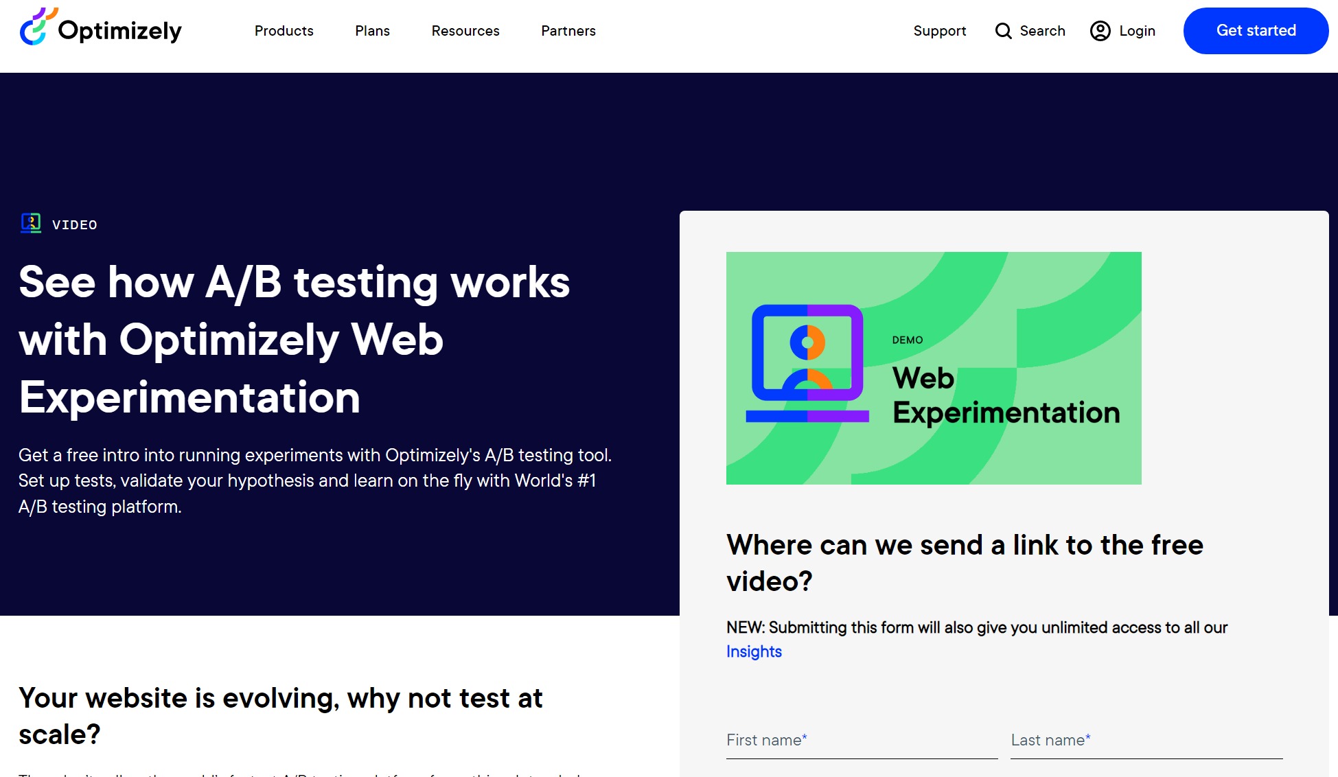
Optimizely’s CTA has two goals: send prospective customers a free introduction video explaining their A/B testing software, and get their contact information.
The homepage gets straight to the point – check out their A/B testing software! The bright white column on the right simply asks, ‘where can we send a link to the free video?’ Optimizely kills two birds with one stone. They get to send top of the funnel prospects more information about their tool all while adding them to their contact list.
RevBoss
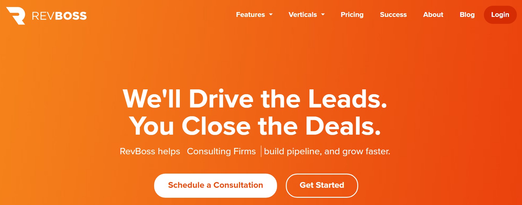
RevBoss is all about delivering outbound leads for their clients. Their homepage cuts straight to the point: “We’ll drive the leads. You close the deals.”
The next line features an interactive slogan where ‘RevBoss helps’ is followed by an array of different industries. They help growth start-ups, marketing agencies, SaaS companies and more.
Their call-to-action button for a consultation is their most prominent, promising a personalized experience. Viewers can also jump right to the point and ‘get started’ depending on where they’re at in their journey.
Contractlogix
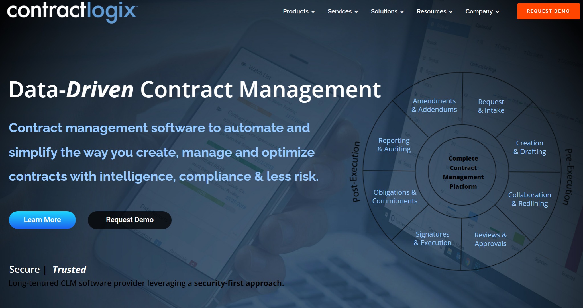
The contract management software does not disappoint when it comes to homepage CTA design. Contractlogix emphasizes their main message: above all else they’re data driven. The graph to the right slides in to display the different aspects of their platform while two buttons at the bottom catch a viewer’s attention.
Prospective customers can learn more about the platform on their website or, if they’re a bit further down the funnel, they can request a demo. The demo request button is also ever-present in the top right corner of the page as your scroll in a bright orange box.
Practice Makes Perfect
In conclusion, the one surefire way to perfect your digital call-to-action (or any CTA) is to practice!
Do yourself a favor and start testing your CTAs. What language prompts users to take action? Which colors are more eye-catching? Are moving graphics helping or hurting your case?
Don’t forget, your call-to-action doesn’t only exist on your homepage or in a banner ad. If you’re utilizing content marketing (which you should be) each and every blog presents itself as another opportunity for a CTA. We’re about to hit you with one right now…
Digital CTA’s can make or break your lead generation and conversion efforts. And the more people that get sent to your page, the more opportunity you have to convert prospects and close deals.
The best way to get visitors to your website: optimize your blog for search! Having a strong content marketing strategy is the best way to get eyes on the digital CTA’s you just worked so hard to perfect.
Do you need help increasing traffic with your blog? Check out our SEO Blog Writing Services or schedule a free consultation to learn more about how we can help!
The post Perfecting Your Digital Call-To-Action (With Examples!) appeared first on Marketing Insider Group.
Did you miss our previous article…
https://www.sydneysocialmediaservices.com/?p=678


