Posts

funnel showing MOFU content

Recently there’s definitely been an increase in the expectation that marketers need to deliver more than they have in the past. We have to do more than just grow the traffic on our website. We need visitors that convert to leads and paying customers.

Middle of the Funnel (MOFU) content is what gets your blog visitors to convert. And good MOFU content is what 9increases your conversion rate to more qualified leads.

One of the best ways to think about MOFU content is that it is where content marketing and campaigns come together.

So let’s learn about MOFU content and how it helps increase your conversion rates.

What is MOFU Content?

MOFU content is content created for the middle of the marketing funnel with the goal of converting an unknown blog reader or website visitor into an identified prospect.

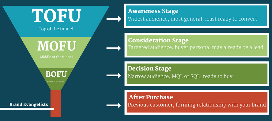
MOFU is often talked about as the 2nd stage of demand generation content along with TOFU (Top of Funnel) content and BOFU (Bottom of Funnel) content.

This is how we describe the various stages on the marketing funnel and why it is called that:

  1. Top of the Funnel (TOFU): Reach new prospects and build awareness
  2. Middle of the Funnel (MOFU): Engage new prospects and identify who they are
  3. Bottom of the Funnel (BOFU): Help prospects make a decision to buy from us through validation and proof points
  4. Retention: retain new customers through loyalty programs.

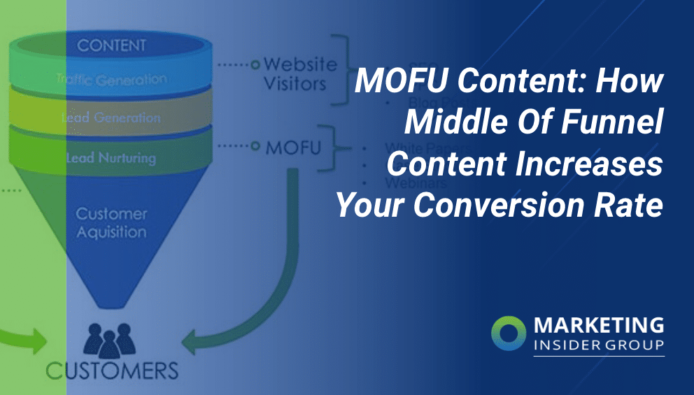
Here’s a great visual that shows how the 4 content types differ by stage. It’s called a marketing funnel because there are more people at the beginning TOFU stage than there are in the latter (BOFU stage).

tofu mofu bofu sales funnel stages
Source: Web Ascender

So unlike TOFU content which is designed to capture someone’s attention. MOFU content is designed to gather their information.

What Types of Content Are MOFU?

While blog posts, social content, short form videos, or podcasts are the best forms of early-stage of TOFU content, MOFU content formats include Whitepapers, E-Books, Webinars (live or recorded.) Other forms of TOFU content might include Email Nurture campaigns, free templates, or even customer stories.

Whitepapers

A whitepaper is a relatively longer report on a particular topic that dives deeper into an industry problem or challenge and is intended to show an objective solution to those problems or challenges.

The term whitepaper evolved from typical colorful and glossy promotional brochures and sales sheets in the technology industry that were obviously trying to sell a company product or solution.

In contrast, a “whitepaper” was intended to appear more educational and objective, often filled with industry research, analyst quotes, and devoid of selling. Back when I was doing demand gen for larger tech companies, whitepapers were often purchased from 3rd party analyst firms like Forrester or Gartner for $10,000 or more and used as an obviously objective piece of content to get you provide your name and contact details.

These traditional whitepapers were also often 10-20 pages in length. While this practice has become less popular, the concept remains in the form of analyst reports, or shorter, more visual buying guides.

E-Books

E-Books have evolved from whitepapers to become the more visual type of guides you predominantly see today. Ultimate Guides, buyer guides are the predominant form of e-books and they typically come in around 3500 words but visually designed into about 10 pages with callout boxes for quotes and stats.

We create about 50 e-books every year for our clients averaging about $5000 each (with design!) We have a long form Ultimate Guide to Content Marketing, and here’s an example of one of our e-books

Webinars

Webinars are online / virtual events that typically will include a professional speaker or a subject matter expert providing insights like trends, tips and how to.

Templates

Template packs have become super popular recently due to their practical nature.  Templates help your potential customers to solve real-world problems they are facing and encourage them to come back to your brand for more insights. Here is a link to our Ultimate Content Marketing Template (our highest converting page on the whole site!) and our content marketing starter kit:

Email Nurture

Email nurture series are responsible for driving about 75% of our leads! We try and earn our visitors email addresses through our newsletter subscription. And then we nurture those subscribers through a series of subtle and not-so subtle messages, stories, content, and promotions.

Customer Stories

I have a strong opinion about how to use case studies and customer stories in content marketing: make your customer the hero of the story!

If you check out our case studies, you’ll find they do certainly validate the success we helped our clients achieve but they mainly talk about our client’s success, not how awesome we are.

There is a way to bring product-led content into the marketing funnel, as long as we keep the customer as the hero:

Some other forms of MOFU content include checklists, videos and slideshows.

How Well Does MOFU Content Increase Conversion Rates?

We are obviously big believers that content marketing improves sales. After all, the whole reason to do MOFU content is to drive conversions.

Most people don’t visit websites to read your blogs and then ask to buy something. MOFU content keeps them engaged long enough so they can get educated on how to buy your product or service. And if you’re lucky, your MOFU content is good enough to convince them to buy from you. Not because of your features and benefits, but because you’ve built trust and authority!

So the real bottom line is that if you don’t have MOFU content, you are missing out on the majority of leads you could generate from your content marketing efforts.

According to CMI, after TOFU content, MOFU content is the 2nd largest bucket of content budget and focus:

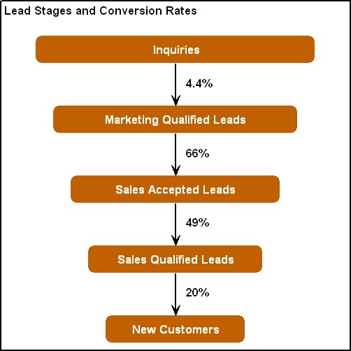
So it’s important to focus on MOFU content and getting it right. OK so now let’s get to the math. A few years ago, a firm called Sirius decisions published research that showed that most B2B firms see a 4.4% conversion rate from inquiries (new names and email addresses) to leads or Marketing Qualified Leads (MQLs).

B2B Marketing Directions: An Inconvenient Truth About B2B Demand Generation

My own experience at SAP showed about an 8% conversion rate to MQL. The reason we scored higher was because we relentlessly tested our MOFU content. Sales and product teams would ask us to try and use brochures and fact sheets to get leads. But we found that thought leadership content was the best way to increase conversion rates.

For more updated information on lead conversion rates, check out our latest data on that.

Content Marketing Made Easy with Our Content Builder Service

If you are ready to get more traffic to your site with quality content published consistently, check out our Content Builder Service.

Set up a quick consultation, and I’ll send you a free PDF version of my books. Get started today and generate more traffic and leads for your business.

The post MOFU Content: How Middle Of Funnel Content Increases Your Conversion Rate appeared first on Marketing Insider Group.

computer with a bunch of pop-up errors

Are pop-ups still worth your while? While they may seem outdated and annoying, they have the potential to deliver a 150% ROI!

The key is to avoid making mistakes that give Google cause to penalize your site and visitors reason to leave it. Take inventory of your current pop-up ads. If you aren’t seeing CTR of at least 10%, you’re below average.

Read on for 6 mistakes to avoid at all costs to help boost your pop-up ad success rate.

Key Takeaways: 

  • Pop-up ads aren’t dead. But they are specific! A well-done pop-up ad will deliver a conversion rate of up to 42%.
  • Keep it simple and worthwhile with to-the-point copy and irresistible offers. 
  • Visuals are everything, within the pop-up itself and its placement. 
  • Always test what works best for your audience and optimize your pop-ups frequently. 

Is Creating a Pop-Up Even Worth Your While?

First things first, what is the purpose behind creating pop-up ads? You won’t see success in pop-up conversions without understanding what you should be looking for!

Your pop-up should be a powerful, obvious and easily actionable CTA. But, as all facets of marketing, they have to be executed in a certain way to be effective.

The nature of a pop-up is interruptive, it’s even in the name! But Google has been penalizing ads deemed “intrusive” since 2017. Even though this sounds contradictory. It doesn’t have to be. One great example is exit pop-ups. They only appear when a user is about to leave your page, so they don’t ruin their experience on your website.

When done correctly and tastefully (aka not ruining your user’s experience) pop-ups can convert at a surprisingly high rate. The average conversion rate for pop-ups is 11.09%, which is already a pretty impressive number! Optimized pop-ups stand to convert as high as 42% of website visitors in some cases.

So how do you make your pop-ups some of the more successful ones? Here are some things you have to avoid like the plague when it comes to creating a pop-up ad.

6 Mistake to Avoid

1. Weak Offer

The biggest issue that ultimately impacts the success of a pop-up has to do with the offer you are presenting. Put plainly, if your offer is weak, your audience is not going to convert.

But what does a weak offer look like exactly? Here are some questions to ask that can help you decide if your offer is too weak:

  • Do you think your offer is worth what you’re asking for? Consumers are naturally wary of providing their personal information to companies and brands. Is the offer you’re presenting worth it? If all you’re promising is email updates and announcements in exchange for an opt-in, the answer is probably no. Your website visitors need to feel like they are getting access to something special that no one else will have access to unless they subscribe.
  • What are your competitors offering on their pop-ups? Have you visited the websites of your competitors recently? What kind of offers are they presenting to website visitors? How do those offers compare to yours? The answers to these questions will help you build more compelling pop-up offers for your potential customers.
  • Is your offer specific and relevant enough? Will your offer be compelling to your audience specifically? Will they feel within a few seconds of seeing your pop-up that they have to opt-in? If so, you likely have a pop-up that will convert. To make your offer specific and relevant, you have to use the right images and language. More on that later.
  • Would you offer your information in the pop-up? Put yourself in the shoes of your visitors—if you were presented with the pop-up you created, would you engage with it? If not, it might be worth revisiting.
  • Does your offer remain static over time? Are you testing multiple offers over time? Launching a/b tests on your pop-ups is one of the best ways to boost conversions and understand how to optimize the language and other components you use to try to connect with prospects on your website as a whole.

How to Fix:

To create stronger offers, try implementing the following 3 tips:

  • Tip #1: Ask your customers. In order to determine which offers would be most compelling to your website visitors, take some time to ask some of your best and most loyal customers. Send them 1-on-1 emails or get on the phone with them to discuss three options. Offer them a discount or a perk for providing you with insight.
  • Tip #2: Be specific. Make sure your language and imagery aligns well with the audience you’re trying to attract. Be specific and help your website visitors understand why they specifically should engage with the CTA you include in your pop-up.
  • Tip #3: Test often. Don’t let your pop-ups sit for too long. Always be testing different language, graphics, button color, size, placement, and offers.

And if you need some inspiration, check out the highest converting types of pop-ups:

Image Source: OptiMonk

2. Too Much Copy

Your conversions and engagement could also be low because of the amount of information you’re trying to squeeze into your pop-up. Too much information in your pop-up could be overwhelming people, especially if they are visiting your store for the first time. When you try to include too much copy in your pop-up, it can make it look too busy, too “loud”, or too forceful.

How to Fix:

To improve your pop-up copy, consider implementing the following tips:

  • Tip #1: Trim the fat. First things first, read through your pop-up copy and determine if there are any extra words that aren’t needed. Your goal is to help your store visitors understand your offer within just a few seconds. You might think that using clever or illustrative language in your pop-up will convince people to take action, but it’s actually more likely to distract. Use as little language as possible in order to attract, inform, and motivate. Let your brand voice and style shine on your product pages instead.
  • Tip #2: Get user feedback. Before ditching your pop-up strategy altogether, it’s worth getting some feedback from other people in order to determine what’s working and what’s not. Recruit your friends, family members, or colleagues in the industry and ask them to take a look at your pop-up. Give them specific questions to answer when they go to review it (ex. Do you understand the offer being presented? Is it an attractive offer? Do you understand what you’re supposed to do next? Would you actually follow-through on the action?) The answers to these questions will ultimately help you optimize your pop-up for future website visitors.
  • Tip #3: Explore better writing. If your pop-up isn’t driving people to convert in the way you expected, it might just be because your writing isn’t compelling enough. To learn how to write conversion-driven copy, explore this helpful resource.
  • Tip #4: Find other examples. If you’re not sure what your pop-up should look like or what language you should be using to motivate your website visitors, look for examples on other ecommerce websites. Most are using pop-ups in some way or another (to build their email list, to announce a new product, to share an exclusive offer, etc). If you’re looking for a place to start, spend time looking through the 40 website pop-up examples featured in this article from Printful.

3. Poor Visuals

In the ecommerce, visuals are everything. As I’ve written about before many times, you can’t drive online consumers to buy without effective visuals placed throughout your ecommerce store. Why? Because consumers are used to buying products in brick-and-mortar stores—stores that they can physically visit to see and touch the products they’re thinking about buying. In ecommerce, you can’t offer that same shopping experience, unless you’re one of the few brands that let’s customers try before they buy (the shopping experience made famous by Warby Parker).

Visuals help you bridge the gap. Well-placed, well-produced visuals can help build a brand identity, differentiate from competitors, attract your ideal customer, and sell more products. On the flip side, poor visuals can wreak havoc on your ability to get your visitors to convert.

Visuals can make or break your pop-up. A great visual can create excitement, urgency, and action. A bad visual can breed hesitation, uncertainty, and a lack of trust.

How to Fix:

To ensure that you’re using the best and most effective visuals possible in your pop-ups, follow these tips:

  • Tip #1: Understand how to take great product photos. The best thing you can do is spend time understanding how to excel at product photography.
  • Tip #2: Use photos of people using your products. Don’t just feature your product—feature people happily using your products. It’s a great way to quickly connect with visitors who are landing on your website and seeing your products for the very first time.
  • Tip #3: Keep it simple. Don’t use complex images or backgrounds in your pop-up. Focus on the product and the type of person who would benefit from using it.
  • Tip #4: Avoid using low-res photos. Avoid using low-quality or blurry photos. If you need to, hire a graphic designer or developer who can help you export and upload photos correctly.

4. Bad Placement or Timing

In order to get any sort of ROI from showing pop-ups to your ecommerce store visitors, you need to make sure that they are being displayed in the right places and at the right time. A poorly placed or poorly timed pop-up can leave the wrong first impression, prevent would-be customers from moving forward with the purchases they intended to make, or worst of all, drive visitors away from your website and store altogether.

There are a few ways you can format your pop-ups. You have to take inventory of your audience and decide which version will work best for them. Take into account the kind of content your pop-up will appear on. If it’s your homepage, a welcome mat pop-up might work best. A pop-up on your blog page should be less distracting, since your visitor came to your page to read your content, not an ad.

image of different types of pop-ups, welcome mats, banners, overlays and slide in

Image Source: HubSpot

How to Fix:

To ensure that you’re displaying pop-ups at the right time and place, follow these tips:

  • Tip #1: Delay homepage welcome pop-ups by at least 5-7 seconds. Give visitors a chance to see and familiarize themselves with your homepage for a few seconds before bombarding them with an offer.
  • Tip #2: Don’t show pop-ups too often. Use pop-up software that allows you to customize how often the same person sees your pop-ups. For example, don’t show them the same pop-up to a person each time they navigate back to your homepage during the same visit. Prevent a pop-up from displaying again to the same website visitor until a certain amount of days has passed.
  • Tip #3: Don’t show pop-ups on shopping cart or checkout pages. Reduce friction by preventing your pop-ups from showing up on pages that take customers through the buying journey. Make it as easy as possible for them to complete the process.
  • Tip #4: Don’t show pop-ups on mobile. Avoid complicating your mobile shopping experience with pop-ups. Pop-ups that cover too much website content on mobile devices can result in penalizations from Google.

5. Too Salesy

To win in ecommerce today, you can’t sell products. You have to sell experiences. Online consumers don’t want to be sold to—they want to interact with brands that will help them create experiences and memories. They want to engage with companies that can help them achieve their goals (travel more, eat better, exercise more, become more productive, etc).

If your pop-ups haven’t been converting, it might be because they are coming across as just a little bit too salesy. Because the nature of a pop-up is already inherently forceful to most people, it’s your job as an ecommerce marketer to present them with messaging that doesn’t come across as aggressive or forceful.

How to Fix:

To ensure that your pop-ups aren’t overly salesy or pushy, follow these tips:

  • Tip #1: Know your audience. Understand how your audience prefers to be communicated with. Use the language that they are used to seeing and hearing when building your pop-up and writing your copy.
  • Tip #2: Don’t use gimmicky language. Just because you see a phrase somewhere else, doesn’t mean it’s actually working. Avoid using cheesy sales language and conversion-driven words that make eyes roll.
  • Tip #3: Present a legitimate offer. This goes back to the beginning of this article—if you’re going to present a pop-up to your website visitors, you better be making a good offer. If not, you’re only going to make your visitors feel like you’re only interested in figuring out how to get their money as fast as possible. Remember: your goal is to build relationships and sell  the idea of an experience to the people who land on your website.
  • Tip #4: Make it easy to opt-out. Don’t make opting out of your pop-up a mystery for people. Make it easy for your visitors to understand how to collapse or dismiss a pop-up if they don’t want to interact with it.

6. Not Optimized Through Testing

If your pop-ups aren’t converting and you’re not taking the time to launch different variations for your website visitors to see and engage with, you’re missing out on a huge opportunity to learn about your audience and what actually compels them to take action.

How to Fix:

This one is plain and simple: use pop-up software that allows you to launch A/B tests of your pop-ups, and then actually take the time to build and launch your tests! Review results, gather insights, and make changes accordingly to drive more conversions.

Over to You

How do your pop-ups perform when compared to these mistakes? It’s never too late to make a change! The key is to always be testing different versions of your pop-ups until you find the one that works best for your audience.

If you’re thinking of starting a blog for your website and aren’t sure where to start, schedule a free consultation with us now! Check out our SEO Blog Writing Services for more information. 

The post 6 Reasons Why Your Pop-Ups Aren’t Converting (and How to Fix Them) appeared first on Marketing Insider Group.