Is it Time to Redesign Your Website? 7 Telltale Signs

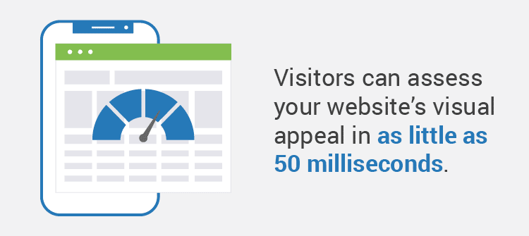
Redesigning a website can be a major task, but in many cases, it’s necessary for your site to survive and thrive. Visitors can assess your website’s visual appeal in as little as 50 milliseconds. That means you may only have a fraction of a second to make a positive first impression.
A poorly designed website doesn’t only lead to a negative user experience—it can also reduce your organization’s return on investment (ROI). In today’s digital-first world, your website is a critical tool for driving online engagement. Without a well-designed and informative website, you can miss out on connecting with potential customers or supporters and spreading brand awareness.
So, how do you know when your website is ready for a revamp? Let’s explore seven common signs that it’s time for a redesign.
1. Your website isn’t user-friendly.
Your website is meant to engage your audience members, whether they’re customers, beneficiaries, members, or supporters of your organization. If your site isn’t user-friendly, your audience simply won’t want to use it.
As you assess your website for user-friendliness, pay special attention to the following elements:
Accessibility
Accessibility means that your website is usable and inclusive for all visitors, including people with disabilities. If you designed your website with the Web Content Accessibility Guidelines (WCAG) in mind, it should be in good shape to engage all audience members equally.
If not, you may be able to make a handful of basic accessibility improvements, such as adding alt text to images or captions to videos, that make a major difference in enhancing accessibility.
However, you might need to consider a larger-scale redesign if your foundational website and brand elements, such as your font and color choices, aren’t accessible. If your website font is difficult to read or your color combinations don’t have sufficient contrast, it may be time for a larger conversation with your team about how you can make your site more accessible.
Navigation
Another aspect of a positive user experience is simple, easy-to-use navigation. Your menu should be easy to understand and highly visible on each web page. Consider using breadcrumb navigation to help web visitors understand their current location in relation to other pages and navigate back to previous pages as needed. Also, make sure your website offers a search function to help users quickly navigate to the pages they want to view.
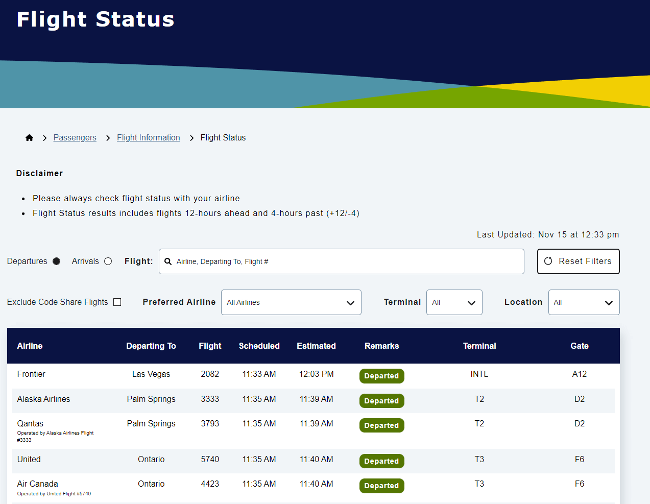
For instance, take a look at how the San Francisco International Airport’s website helps visitors understand exactly where they are on the site and how they got there. The website’s clear breadcrumb navigation makes it easy to check crucial details like flight information in just a few clicks.
2. Your website is too static.
A plain or outdated website can hold you back almost as much as one that provides a negative user experience. There are around 1.88 billion websites on the internet, meaning you have to go above and beyond to encourage users to explore yours. A visually interesting design sets your website apart and helps you stand out in this crowded landscape.
Your website might suffer from a static design if:
- Your content isn’t engaging or interactive. Visitors should have ample opportunity to engage further with your website by clicking on buttons, hovering over elements to reveal more information, and viewing compelling images and videos.
- Your design looks boring and basic. Certainly, there’s something to be said about minimalism. However, you don’t want to take your minimalist design too far and end up with a boring website. Your site should be easy to navigate while still offering an intriguing visual component through your use of color and graphic design.
- Your design is dated. Research from GoodFirms shows that 38.5% will leave because of outdated design. Your website should feature a timeless, responsive design that can last for years to come.
A dynamic, engaging website can serve as a sustainable resource that appeals to a broad audience.
3. Your branding is outdated.
Your website should reflect your current business goals and brand identity. If it doesn’t, you could unintentionally confuse audience members about what your organization offers.
Whenever your organization undergoes a major branding shift, it’s necessary to redesign your website to ensure it tells a cohesive story along with your other marketing materials.
For example, perhaps you’re thinking about redesigning your healthcare website. Over the past couple of years, your organization has shifted from only accepting adult patients to also offering pediatric care. Therefore, you should redesign your website to reflect your new offerings and include new pages that address your children’s healthcare services.
4. Your conversion rate is decreasing.
Your site may receive a decent amount of traffic, but perhaps that traffic isn’t converting into actual support or sales. If that’s the case, your website may suffer from a conversion problem.
Depending on your organization type, you’ll want to keep an eye on the following types of conversions:
- Donations. For nonprofit websites, donations are among the most important conversions to track because they represent a nonprofit’s ability to transform website visitors into actual supporters. You can increase donations by making your online donation form more accessible across your website. Include a link to the page in your menu and throughout your blog posts.
- Registrations. Whether you’re a business hosting an event or a nonprofit recruiting volunteers, registrations are an important indicator of how willing your audience members are to engage with your events. You can also increase registrations by including pop-up messages or buttons directing visitors to the registration page.
- Purchases. If your business offers an online store, purchases are a crucial conversion to monitor. If you note a significant drop in sales, it’s worth considering redesigning your online store to make it more user-friendly. Feature high-quality product images, provide an easy-to-use search/filter tool, and offer a range of payment options.
Whether you’re a nonprofit, business, or another type of organization, conversions demonstrate your audience’s willingness to contribute their time or money to support you. Redesigning your website to boost conversions can positively impact your ROI.
5. Your bounce rate is increasing.
Bounce rate measures how many visitors leave your website after only visiting one page. If your bounce rate is high, it might be a sign that your website isn’t effectively keeping visitors’ attention.
You can encourage visitors to explore multiple pages on your site by incorporating more calls to action and enhancing connections between pages. For example, let’s say you receive a significant amount of traffic from people clicking on your blog posts, but these readers don’t stick around on your site after viewing your posts. You can add links to other educational pages at the end of your posts or buttons that send visitors to your online donation page or store to extend their engagement with your site.
6. Your website isn’t SEO optimized.
Search engine optimization (SEO) is the process of crafting the content of your website to appeal to visitors, resulting in ranking more highly on search engine results pages. If you’ve noted a recent drop in SEO performance that’s impacted multiple website pages, your design and heading structure might partially be to blame.
SEO performance directly corresponds to the quality of your user experience. Responsive design is one of the most important SEO considerations—the GoodFirms study shows that 73% of visitors will leave a website because of unresponsive design. Other SEO design best practices include site speed and accessibility.
Lastly, through your redesign process, it’s important to ensure that your website pages are optimized for specific keywords. Each page should include a unique keyword that you use throughout the headings, meta descriptions, and other metadata. This shows search engines that your pages are useful for people researching related terms.
7. Your website isn’t mobile-friendly.
Mobile-friendliness is a key factor in your website’s usability and SEO performance. About 59% of all web traffic comes from mobile devices. If your website isn’t mobile-optimized, you could be missing out on engaging mobile visitors.
The good news is that you can improve your site’s mobile friendliness with a few quick changes in your redesign process. Compress all images to promote fast load speeds and ensure your text is large enough to be read on mobile devices. As you design your website, consistently check the mobile view to ensure that any design changes don’t cause mobile formatting issues.
As part of the mobile design process, you can use Google’s free mobile friendliness test to determine where your site currently stands.
Not every website needs a full-fledged redesign. Some websites simply need smaller design adjustments to improve aspects like accessibility or blog post SEO optimization. However, if your website exhibits any of the signs discussed above, it could be time to consider a more robust overhaul.
As you begin the redesign process, don’t hesitate to reach out to a web design and development agency as needed. These professionals can help manage the redesign process to ensure your website follows best practices and offers a cohesive, fulfilling user experience.
The post Is it Time to Redesign Your Website? 7 Telltale Signs appeared first on Marketing Insider Group.